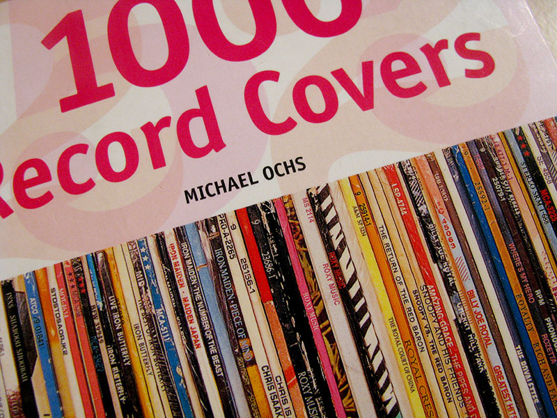
We here at Unified are crazy about beautiful custom vinyl records and vinyl record sleeves.
We’ve been making creative releases since 2008 and lovely packaging has become an obsession of ours. Of course, we searched the internetz for the greatest vinyl record sleeves of all time.
Who else can be better judges at this than music packaging designers?
Table of Contents
The Beatles – The White Album (1968)

Chosen by: Jonathan Barnbrook, creator of the sleeves for David Bowie’s Heathen, Reality, The Next Day and Blackstar
By contrast to Peter Blake’s vivid artwork for the Beatles’ previous album, Sgt Pepper’s, Richard Hamilton’s sleeve was a plain white sleeve with the band name just embossed, almost invisible. I thought it looked boring until I studied art. It placed an avant-garde idea into the mainstream – the cover is a blank space on which you can project your fantasies.
________________________________________________________________________
Grateful Dead – Aoxomoxoa (1969)
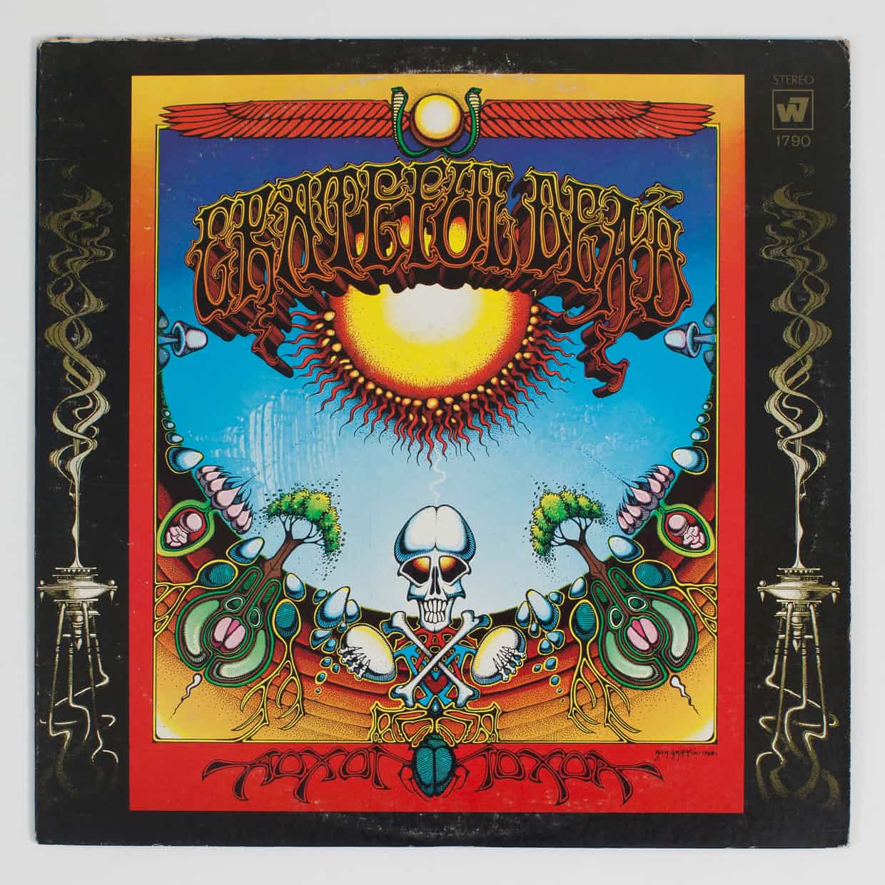
Chosen by Roger Dean, designer of more than 100 fantastical album covers, most famously for Yes
By the end of the 60s, we had people walking on the moon and Concorde zooming across the Atlantic in three-and-a-half hours. The future seemed right around the corner. I was obsessed with designing the future, but the graphic designers of the day were hardwiring it into our existing culture with their decades-old design and fonts.
That’s why Rick Griffin’s cover had such a powerful effect on me, and is still my favourite sleeve. He had changed the use of lettering completely but it was still legible.
The painting looks as if it comes from a completely other world. It seemed to be saying to me that the rules were bullshit, that we could do anything we wanted. When I look at it, I see freedom.
________________________________________________________________________
Kraftwerk – Autobahn (1974)
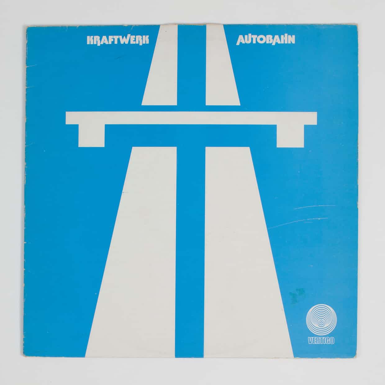
Chosen by Peter Saville, famed for his work with New Order, Joy Division and Factory Records
Autobahn was the first album I ever bought, after I heard the single on the radio. In 1974, as a teenager who had never been abroad, listening to the full 22-minute title track while staring at the autobahn symbol on the sleeve felt like being taken on a journey.
I was on a European highway, in a soundscape crafted by classically trained musicians, seeing cathedrals and power stations, villages and skyscrapers, ancient and modern, in time as well as distance. It was a continental tour – from gothic to postmodern, from the dark ages to Brigitte Bardot – with the pulsebeat of a speeding vehicle. All defined in a simple symbol. As a fledgling visual artist, this was my first lesson in semiotics.
I realised that visual codes acted as keys to unlock the huge range of potential awareness in an audience. Four years later, when I was asked to do the poster for the first night of the Factory club, I noticed an industrial warning sign on a workshop door at art college: “Use hearing protection.” I’d been thinking “Factory … new music … industrial city” and realised: “That’s it!” My Autobahn moment.
________________________________________________________________________
Hawkwind – In Search of Space (1971)
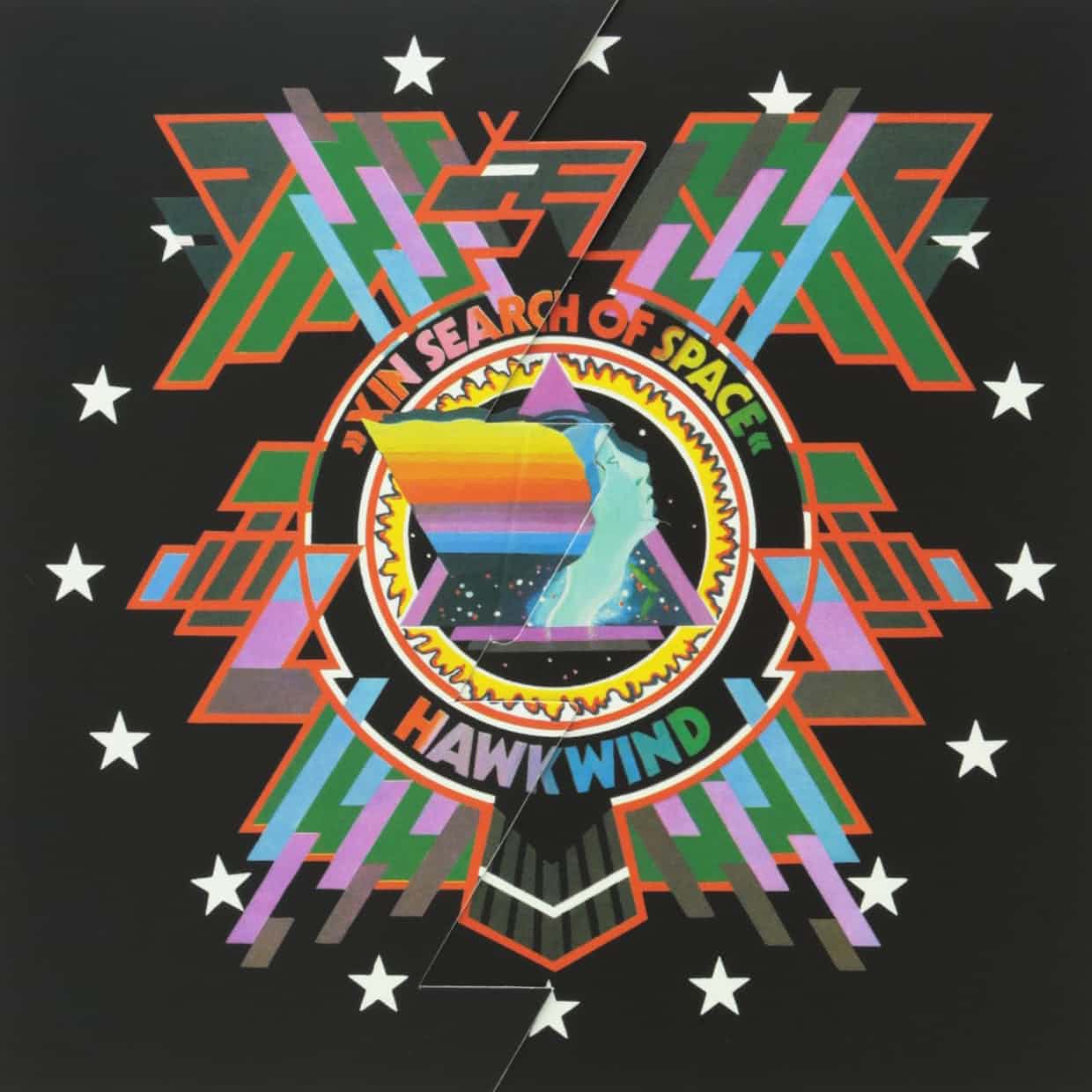
At my grammar school, you displayed your allegiances via the album you carried under your arm: Deep Purple in Rock, Genesis’s Nursery Cryme and so on. The longhairs were outsiders, but to be ever more apart, you carried Hawkwind. The designer, Barney Bubbles, was a genius.
This wasn’t just a square of card. It unfolded out to a rough hawk shape. On the front, there was this post-psychedelic, pre-electro, sci-fi mandala. On the back, there were no track titles, just a completely blurred picture of them playing live (which seemed to replicate the Hawkwind live experience) and the words: “Technicians of spaceship Earth, this is your captain speaking, your captain is dead.” Coming with a booklet of countercultural images and texts, it really broke convention for album packaging.
It inspired me graphically, with its geometric shapes and fluorescent colours, and I became immersed in an “alternative” lifestyle and took psychedelic drugs. On one trip in Scotland, I was convinced I could see aliens landing, I experienced synaesthesia and distinctly remember listening to this album through my teeth. When the Sex Pistols came along,
I realised this outsider attitude applied equally to another counterculture, punk.
________________________________________________________________________
Iggy Pop – Lust for Life (1977)
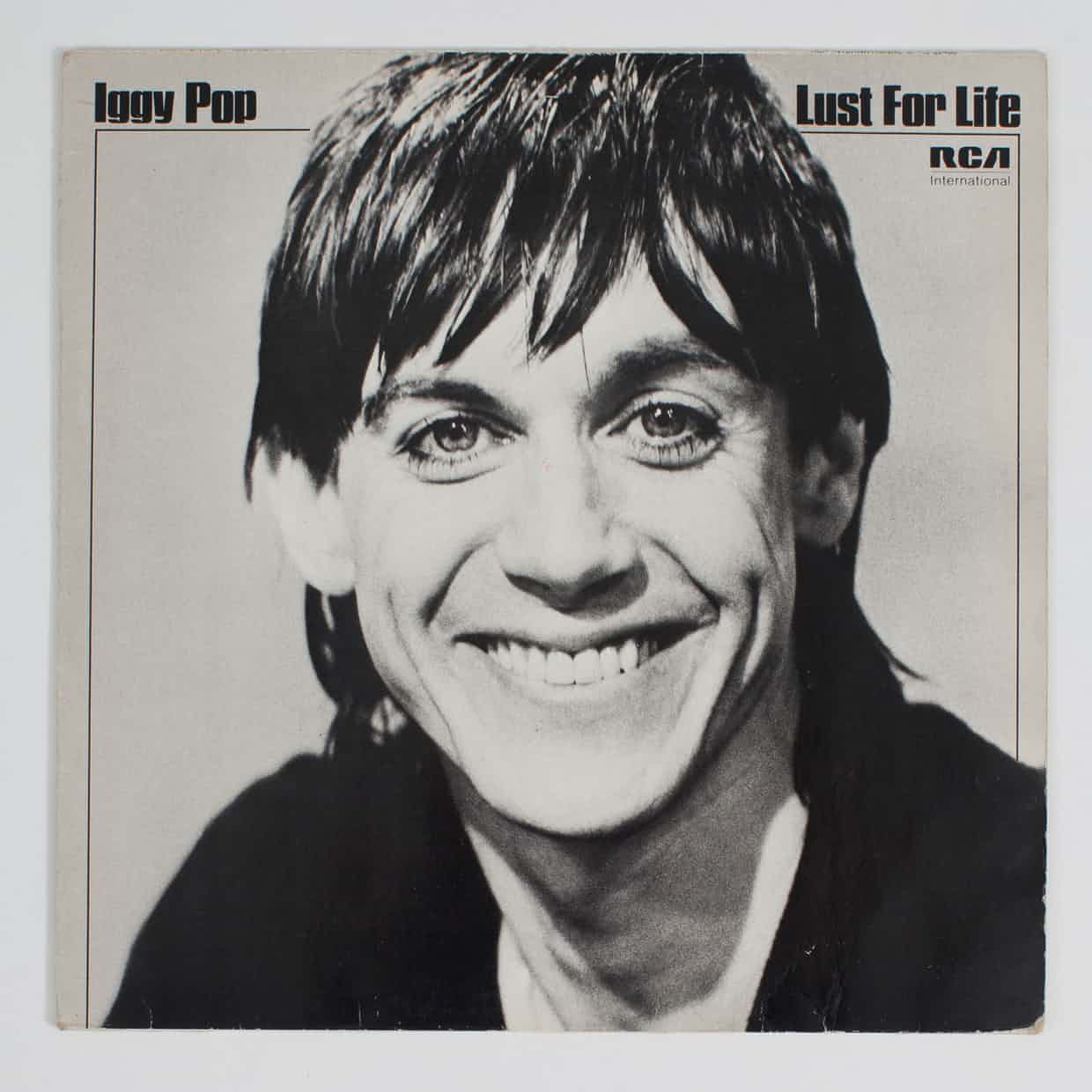
Chosen by Vaughan Oliver, who defined the visual aesthetic of the 4AD label in the 80s
Roger Dean‘s sleeves weren’t about how the band looked, but the use of imagination. In my work, I’m keen on the ambiguous and the mysterious. This sleeve is the complete antithesis of my philosophy, but I like its innocence and directness.
It’s like a high-school photograph and totally fits the words Lust for Life. Iggy looks like a children’s TV presenter or someone about to present the weather forecast, but the record inside is raw and harrowing. It’s the absolute opposite of everything conjured up by the sleeve. I love that.
________________________________________________________________________
Pixies – Doolittle (1989)
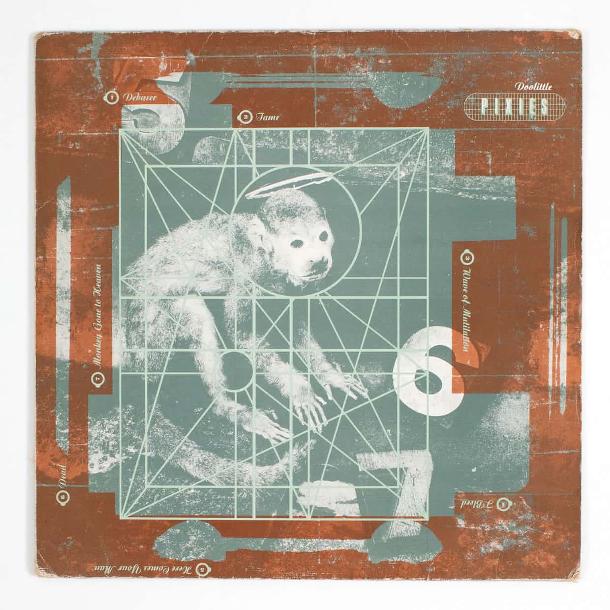
Chosen by Tash Willcocks, Manchester-based illustrator behind sleeves such as Elbow’s Asleep in the Back
I was brought up in a house in Cornwall where no one listened to music. When I was a teenager, my friends bought this album and showed me it. In 1989, I had never seen anything like it.
The combination of Simon Larbalestier’s photography and Vaughan Oliver’s design and typography was the most beautiful thing I had ever seen. I thought: “Whatever that is, that’s what I want to do.” I had always been a messy person, but suddenly everything made sense.
I realised that in art and design, you can get your hands dirty, make mistakes and embrace them. Before this, to me, a record cover meant a boyband on a sleeve, which made me want to puke, but here was something I could emotionally engage with. It gave me no answers, only a million questions. Why are the letters like this? Why is the print over the top of everything? I can’t even remember playing it, just staring at it and it taking over my brain. It gave me permission to be me, which has influenced everything in my life.
________________________________________________________________________
Rammellzee Vs K-Rob – Beat Bop (1983)

Chosen by Tony Hung, artist behind Blur’s The Magic Whip
Jean-Michel Basquiat brings something unconventional, bold, playful, thought-provoking, raw and engaging while maintaining an unlaboured feel. Despite being 33 years old, this work feels more potent than ever, when much of our daily eyeline is bombarded with overstylised, computer-perfected, market-led noise. Armed with just a paint stick, Basquiat effortlessly cuts through it all. It’s life-affirming. It reminds me I am a human being and to be a human being, to be instinctive, and that with just primitive tools, we can still make joyful and fulfilling work.
________________________________________________________________________
Joy Division – Unknown Pleasures (1979)
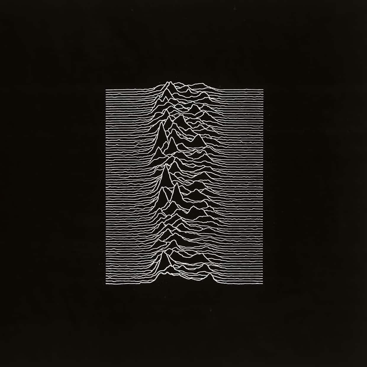
Chosen by Dan Hillier, winner of the 2014 Best Art Vinyl award for the cover of Royal Blood’s debut album
I was five or six when this came out in 1979. When I was younger, I didn’t know what it was or understand it, but something about the graphic always appealed. I later found out that Peter Saville’s sleeve design depicts a frequency wave from the first known pulsar, but it could equally be a landscape or depict musical frequencies.
My experience of the music on records has always been influenced to some degree by the cover art, and this is dark and bleak and jagged, which is perfect for that album. After Royal Blood used my Pachamama image for their album, their manager and I agreed we would have preferred not to have words on the cover.
________________________________________________________________________
Led Zeppelin – Houses of the Holy (1973)
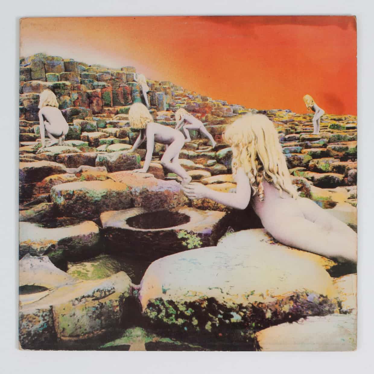
Chosen by Carson Ellis, award-winning illustrator and sleeve designer for the Decemberists, Weezer and Laura Veirs
This has been my favourite album cover for as long as I can remember. Hipgnosisdid lots of the great 70s sleeves and this is weird, timeless and iconic. I recently did a cover for an album of Zeppelin covers called From the Land of Ice and Snow and redrew the Houses of the Holy image in my own style. So I’ve spent a lot of time with it. It’s a photo collage image of nymph-like, mermaid-like, naked children – actually a brother and sister – climbing Giant’s Causeway, in County Antrim, Northern Ireland.
Zeppelin combine blues with fantasy and JRR Tolkien, and all that is on the cover. It seems to signify otherworldliness, something primal and social taboos. There’s something vaguely sexualised about the children, but whatever sexuality it’s alluding to is subtle enough that you can shrug it off.
On the cover of the Decemberists’ What a Terrible World, What a Beautiful World, I drew a stylised, flat depiction of a naked woman, with tiny pink dots for nipples.
I was told that big stores wouldn’t stock it. They were the most benign, non-sexual nipples that anyone ever had.
________________________________________________________________________
Miles Davis – Tutu (1986)

Chosen by Cey Adams, designer of Def Jam Recordings sleeves from the Beastie Boys, Public Enemy and Jay Z
This is one of Miles Davis’s last recordings, in his avant-garde period – it’s named after Archbishop Desmond Tutu. It’s just a stark photograph by Irving Penn of Miles looking straight on, and the edges are faded black [the cover was designed by Eiko Ishioka].
I was taken by the fact that an artist could have a cover without his name on it, and Miles Davis was obviously so popular that he could do that. Miles always had very powerful features, and the texture and detail in his face shows the journey of his career and how much he put into it.
I was drawn to the album by that intense, beautiful stare. I modelled my career on Miles in terms of wanting to push boundaries. For example, Public Enemy’s Fear of a Black Planetwas conceptual art, which no one had done in hip-hop before. However, I was so moved by the Tutu cover that when the time came to do LL Cool J’s greatest hits album, All World, I applied the same idea to an Albert Watson photograph of LL. There was type on the front, but it was on a shinkwrap that peeled off. It was my homage to Tutu.
________________________________________________________________________
Parliament – Motor Booty Affair (1978)
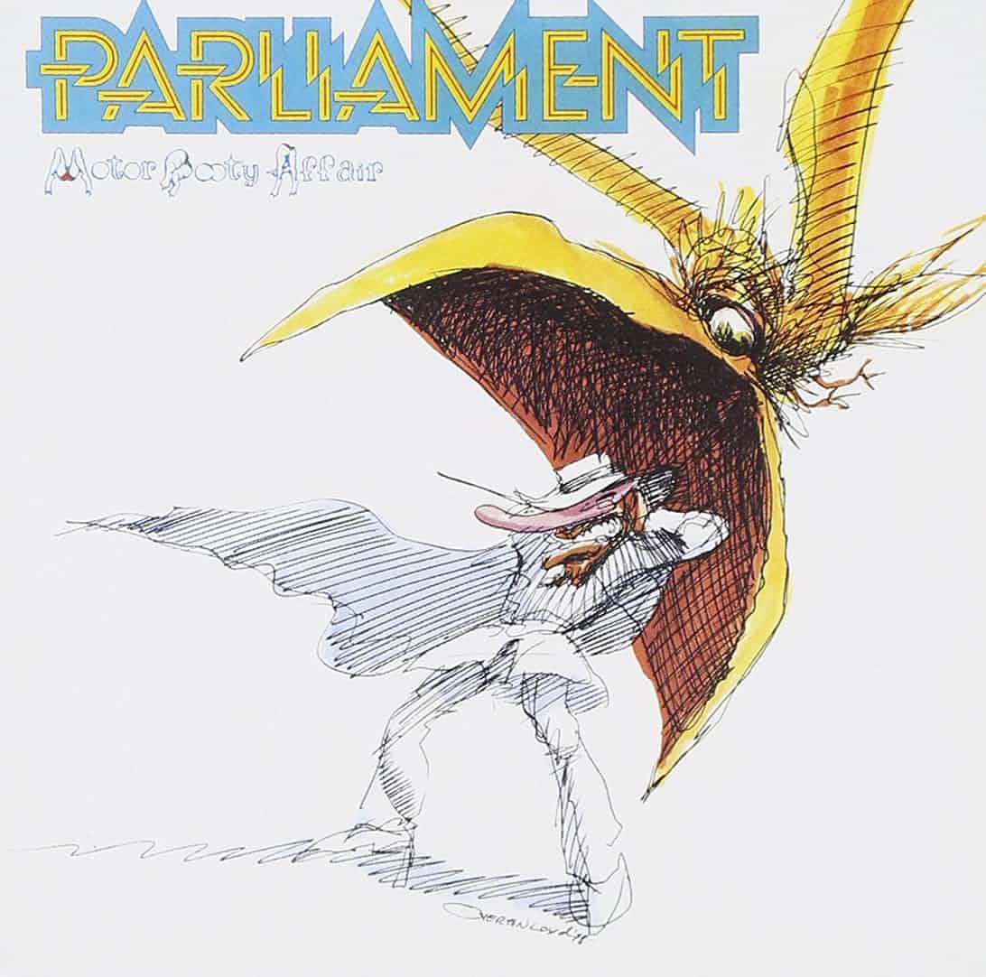
Chosen by Joe Buckingham, designer of various De La Soul sleeves including De La Soul Is Dead
I’ve always liked album sleeves that double as construction kits. I had a Jefferson Airplane album that you could take apart and build into a fully three-dimensional cigar box. The inner sleeve was an image of marijuana, and that sat in the box, so it looked as if it was filled with grass. In this field, though, this Parliament cover is king and is still my all-time favourite sleeve. It was a gatefold with a pop-up element.
If you laid the album flat, this fantasy castle popped up along with various characters you could cut out and stand up in the castle. There were tons of illustrations, and the cover featured a giant bird coming down on the album’s Sir Nose character.
There was just so much to look at in Overton Loyd’s artwork. It really piqued my imagination. I think subconsciously the starkness and simplicity of the cover image against a white background seeped into how I designed De La Soul Is Dead.
________________________________________________________________________
Marvin Gaye – Here, My Dear (1978)
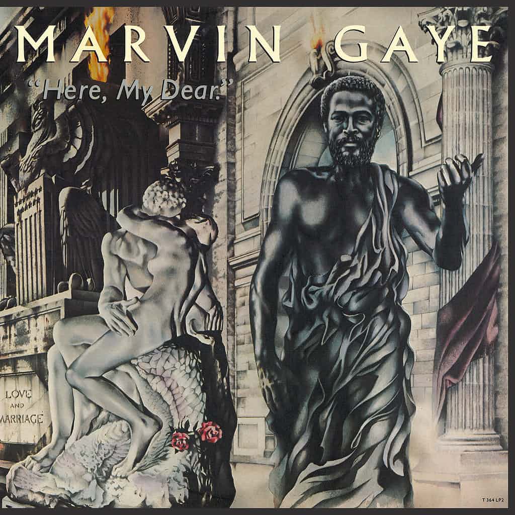
I love this because of the story behind it and the way the cover works with the music. In the mid-70s, Marvin Gaye had had two enormous albums in What’s Going On and Let’s Get It On, but was going through an acrimonious divorce from Anna Gordy.
They agreed a deal whereby she wouldn’t get any money, but would get all the proceeds of his next album, which looked guaranteed to be the biggest record ever. Instead, he sabotaged the deal by making a wilfully uncommercial album, full of songs about their relationship, although it’s now seen as another classic. Gaye gave Michael Bryan, the artist, very specific instructions, so the cover features the singer looking like a Greek god.
The artwork includes the words “love and marriage” and “judgment” and it unfolds to a picture of him handing her this itsy-bitsy, teeny-tiny record. That’s dark, but mostly a record just features a photo of the band. This is a total concept, a snapshot of his state of mind and an amazing art piece.
________________________________________________________________________
U2 – Boy (1980)
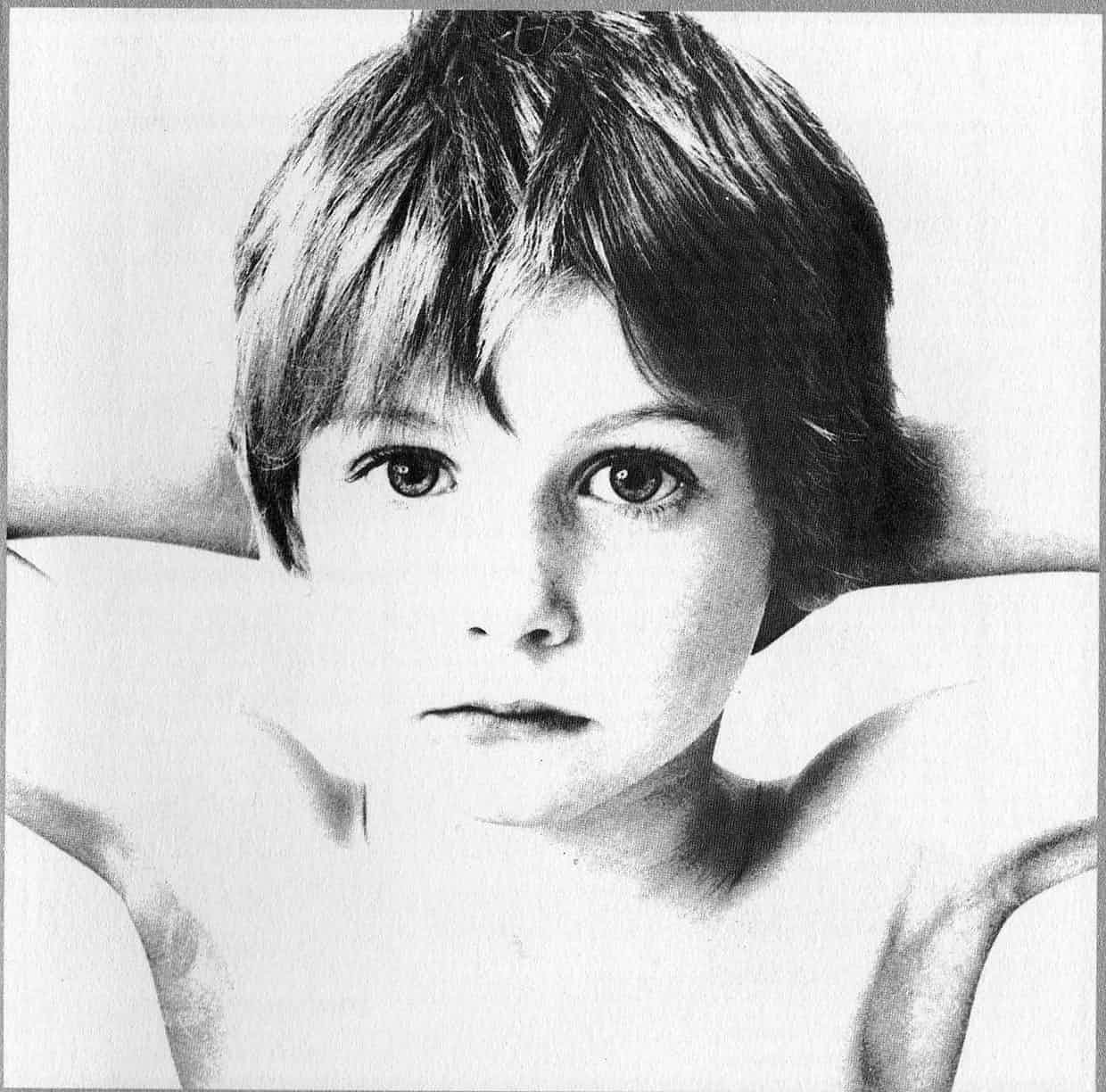
Chosen by Alison Fielding, Beggars Banquet Group creative director, who has designed for the Prodigy, the Specials and the Horrors
When I was about 13, I heard I Will Follow when I was listening to the John Peel show on headphones. I thought it was amazing, and immediately went to this little local shop that sold TVs as well as records, and ordered it.
At that point, I had no idea what it would look like. When I got it, I just thought it was so beautiful, I stared at it for hours. I don’t care much for the graphics, but it’s very evocative of a time in my life that shaped my love of music, and there’s something almost Mona Lisa-like about the photograph on the sleeve. Does it capture innocence, or something darker? They used the same boy two albums later for War, by which point he has a split lip.
So there’s a narrative developing. When I was about 13 or 14, I had this big blue Adidas bag for school, and I wrote “U2” on it in really big lettering in ballpoint pen, but messily and badly. That was my first attempt at graphics.
________________________________________________________________________
Björk – Homogenic (1997)

Chosen by Rochelle Nembhard, who worked on the acclaimed cover for Petite Noir’s La Vie Est Belle
I like covers that relate directly to the musician, more than abstract images. I like some abstract images, but those covers could be anyone. Homogenic is a piece of art, and the fact that she used Alexander McQueen to design it was amazing.
It’s a fusion between African and Asian – the African necklaces and the Asian dress – that stands the test of time. I love all Björk’s covers for that reason – they all show an aspect of her.
The visual aspect of music, the album cover, is important, because it is a picture of the music, depicting the sound. It should be so much more than just a one-dimensional image – it has to be the face of the music. That’s what I was trying to do with Petite Noir, working with the artist Lina Viktor. I knew she had the type of imagery that would translate into his music and stand the test of time.
________________________________________________________________________
Scritti Politti – Work in Progress EP (1979)
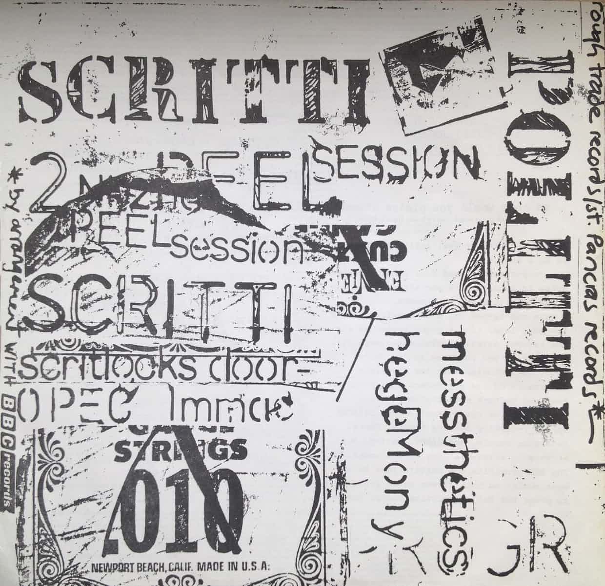
Chosen by Matthew Cooper, designer for Arctic Monkeys, Franz Ferdinand, Hot Chip and many more
I love the DIY aesthetic of the first edition of Elvis Presley’s first album, later homaged by Ray Lowry for the Clash’s London Calling sleeve. The wonky type looks like it has been cut out and stuck on by hand.
There’s another musician awkwardly cropped in the photo of Elvis. Nowadays, the record company would ask you to Photoshop him out. The immediacy of the image and graphics make a statement of intent: “Here I am.” Many years and genres after that was released, the same aesthetic inspired me when I came across this EP of Scritti Politti’s second John Peel session in Chick-A-Boom Records in Sutton Market, some years after it came out in 1979 on Rough Trade Records.
The sleeve was just a plastic bag with two bits of photocopied paper in it. One of them listed the entire costs of making the record, including £65 for 5,000 plastic covers. The other photocopy was of a bag of crisps, a badge and some sugar. It demystified the entire process and I realised that I could do something similar at the local library. So I took loads of stuff down and started photocopying it.
________________________________________________________________________
James Hill is a veteran of the music industry. He first worked at Warner Reprise Records then later joined Interscope/ Geffen Records where he managed producers and songwriters and got his first platinum record for Keyshia Cole’s The Way It Is. He is now helping indie artists with branding and manufacturing through his company Unified Manufacturing, a CD/DVD/vinyl and merch company in LA.