If it’s your first time to release an album, chances are the album artwork is the last thing you think about that’s why it can be a total pain in the arse especially if you’re near your deadline.
Do not underestimate how tedious making an album cover can be. It’s definitely not like submitting a high school project. It requires CD manufacturing process and if you’re ordering by the hundreds (or thousands), you better make sure all the elements are done right. Here are some of the most practical tips for designing album cover:
Table of Contents
Don’t print lyrics unless you have sufficient space
Are you thinking of cramming the lyrics to 12 songs onto a four-panel digipak? Where are you going to put the album credits, copyright info, and crowdfunding thank-yous? Who’s going to be able to read that tiny font anyway?
Lyrics in the album packaging are great – if you can read them. So if a six-page booklet insert or a giant foldout for your LP edition aren’t realities, use the internet as a way to augment your album art and avoid clutter. Post your lyrics on your website in a dedicated section that shares design elements with your album. Then, print the URL to your website’s lyrics section on your album packaging.
Envision your album cover as a thumbnail
The majority of people who encounter your album will do so online. They’ll see a smaller version on digital music platforms like iTunes, Spotify, and Amazon, or on review sites and blogs. Often it will appear as small as a thumbnail. Before you commit to an album cover design, shrink it way down. Does it still capture your attention? If so, you’ve got a winner. If not, try a different approach for your album cover.
Minimalism is in
This is probably related to number three and number four above, but the starker the image, the more it seems to capture our attention. Maybe the modern sensibility is, “Things’ll get shrunk, so things should stay simple.”
After all, it’d be really difficult to make out all the faces on the cover of Sgt. Pepper’s when reduced to a thumbnail. A NYT article from a few years back talks about this album art phenomenon in more detail.
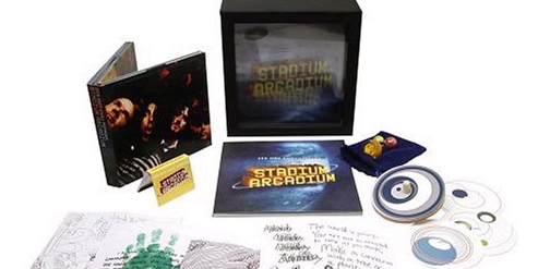
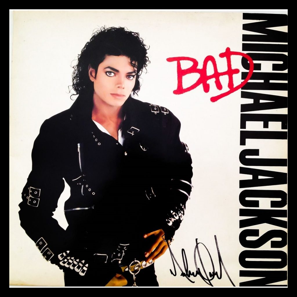
Print your artist and album name clearly on the spine
![]()
Imagine your CD is sitting on the shelves of a radio station library. Can you find the disc among all those other albums? Many DJs are still heavily reliant on CDs, and they need to be able to pull your disc off the shelves quickly.
It’s for this very reason that many stations don’t even accept albums sent to them in thin sleeve packaging. So if you’re serious about a radio promotion campaign, you should consider packaging your CDs in digipacks or jewel cases, and then be sure that the writing on the spine is big, bold, and highly legible.
Text should be in vector format
It is ideal that all text used is in vector-format so that is prints as clearly as possible — if this is desired. Also, try and use fonts that can be embedded into a PDF – additionally, it’s worth converting all your type to outlines in the closing stages of your design work so you don’t have any worries about sending a copy of your chosen font to the printers, where mistakes can be made.
via
Bleed Is Important…
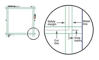
When you print one copy of something, it’s easy to take time to ensure that it is trimmed precisely. When you have hundreds (or thousands) of the same something to cut, the task of cutting out individual sheets, with precision, becomes daunting.
Commercial printers do have equipment that speeds up the process—either by using pre-programmed measurements to cut each piece, or by cutting large quantities all at once—but even the best pieces of equipment aren’t 100% accurate all of the time (due to the limits of technology and paper stretch).
The discrepancy is usually small, but, without bleed, even being half a millimeter off on cutting produces a noticeable white line down the edge of the paper. That’s not what you want for your jewel case insert or digipak. The solution? Extend the album artwork slightly beyond the desired cut line—i.e., add bleed.
This gives the print shop a margin of error when trimming. That way, if they happen to be slightly off when cutting, the continued album artwork shows up instead of the white paper.
In the printing industry, .125” is a commonly requested bleed setting; this means the album artwork extends .125” from the cut line on each side. This will be cut off, so do not include anything like text or titles in this area; please see the next comment about safety margins for more details.
________________________________________________________________________
James Hill is a veteran of the music industry. He first worked at Warner Reprise Records then later joined Interscope/ Geffen Records where he managed producers and songwriters and got his first platinum record for Keyshia Cole’s The Way It Is. He is now helping indie artists with branding and manufacturing through his company Unified Manufacturing, a CD/DVD/vinyl and merch company in LA.