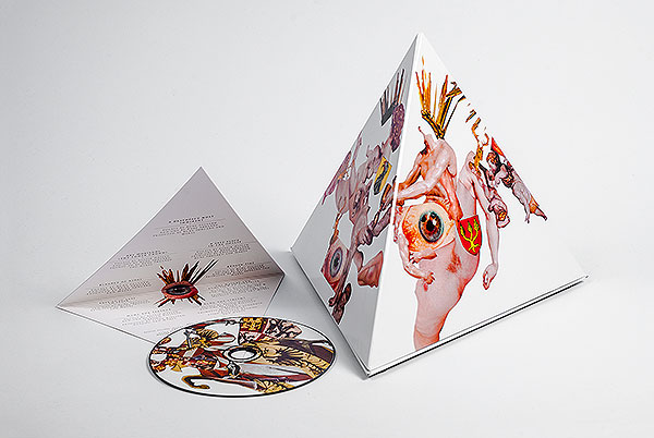
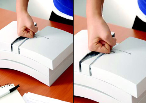
Here are 12 albums that use type (letters) as the album art.
No glossy portraits, no bling-bling, just letters made into artwork. Brilliant!
Table of Contents
Zipper Catches Skin by Alice Cooper
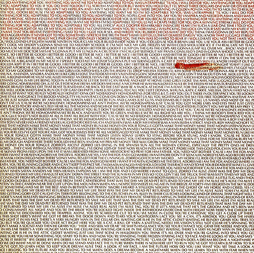
What you get here is just the lyrics from the album presented in block paragraph form on the cover. There is also the very subtle ALICE COOPER across the top of the album via a light red hue shift. This is one of the few Alice Cooper covers that doesn’t feature the man himself. It’s also one of two albums he doesn’t even remember recording (because he’s too drunk)!
Classics by Bugged Out!
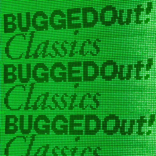
You gotta love the simplicity of the ASCII and Dayglo paper combo!
The Earth is Not a Cold Dead Place by Explosions in the Sky

Looks familiar? Yeah, I think they copied this from Alice Cooper. But then again, the texty concept is not so unusual anyway. Nevertheless, still looks more appealing compared to most album covers nowadays.
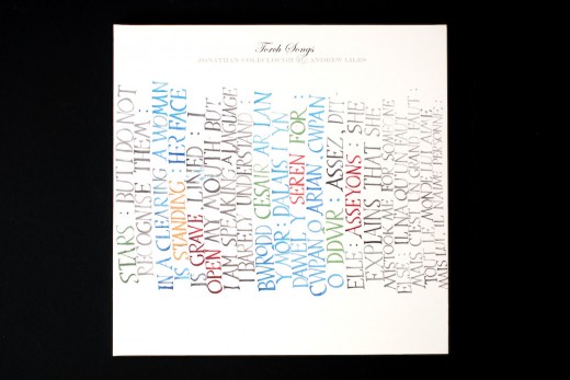
Torch Songs by Jonathan Coleclough and Andrew Liles
The text was written during their performance, brush sounds incorporated into the recordings.
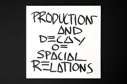
Production and Decay by Spatial Relations
Reissue of original vinyl release on CD retains the 12″ format with pouch for CDs. Basic design ethos is attractive in this hybrid approach.
Go 2 by XTC
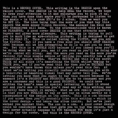
XTC’s Go 2 is designed by Hipgnosis, the UK design group that brought us some of the most original and memorable covers for bands like Pink Floyd, Genesis, etc. Hipgnosis’s trademark story like imagery is replaced by copy poking fun at the art form.
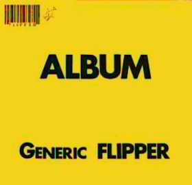
Generic Flipper by Flipper
Here’s an abum with the same “anti-art” mockery as XTC’s Go 2. How profound, right?
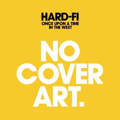
Once Upon a Time in the West by Hard Fi
and here’s another one. Hard-Fi have been patting themselves on the back for “breaking the rules” for their 2007 Once Upon A Time in the West release….err, but everybody knows it’s not original. The Times have a better article regarding this found here.
Come to Daddy by Aphex Twin
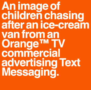
The Designers Republic used a similar treatment in 1997 for the 2nd print of Aphex Twin’s Come to Daddy. I don’t find this very impressive, though. It’s just too much that it makes my eyes roll.
Riot by Paramore

Some People by Rekleiner
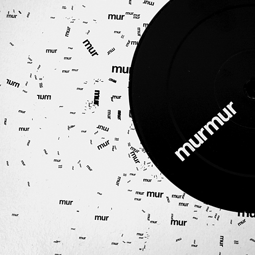
The most creative typographic vinyl packaging I’ve seen. Go check out the other versions here.
_________________________________________________________________
James Hill is a veteran of the music industry. He first worked at Warner Reprise Records then later joined Interscope/ Geffen Records where he managed producers and songwriters and got his first platinum record for Keyshia Cole’s The Way It Is. He is now helping indie artists with branding and manufacturing through his company Unified Manufacturing, a CD/DVD, custom vinyl records and merch company in LA.
