Packaging design is deceptive sometimes, especially for those new to product design. It seems so simple but there are so many considerations for a packaging design to work.
Not only should the packaging be able to contain the items safely and securely, not only should the packaging be eco-friendly and easy to ship, not only should the packaging look good, it should also compliment the product and the brand.
If you’re a beginner and you want to get it right the first time, here’s a basic product design guide to successfully designing an effective and good-looking product packaging.
Table of Contents
#1 BE DIRECT TO THE POINT
Customers, even the most loyal ones, want to know right away what you’re offering. They simply have no time or attention span to analyze what it is you’re actually selling.
Make sure that in just a few seconds, they can get all the important details and information without much effort.
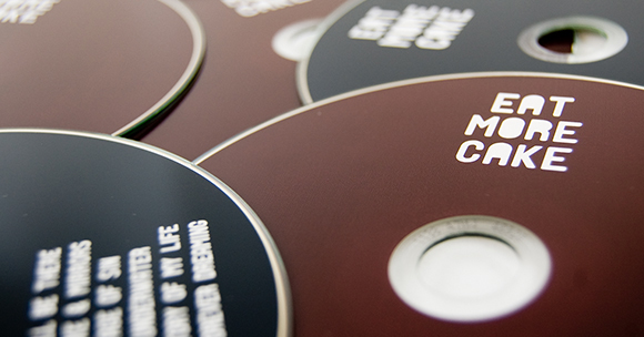
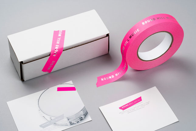
#2 BE CONSISTENT
Make sure that the design of your product packaging is consistent to the branding and design of the website, posters, merch, and more.
You cannot be too cluttered or else you’ll have to go back to the start and correct everything. Start with the brand and the big idea first before you make the individual design for each packaging or collateral.
#3 DESIGN FOR YOUR MARKET
Who’s your target market?
Are you designing for teenage boys who love punk music and skateboarding or are you designing for yuppies that prefer to stay home and chill during weekends?
You cannot design for everybody because everybody is not your market. Once you’ve defined who you’re trying to attract, it will be a lot easier for you.
#4 FIND OUT WHAT HAS BEEN DONE BEFORE
Research the packaging designs that has been done before.
They could serve as your inspiration or they could serve as your limit (you don’t want to do what has been done a lot of times before).
#5 CHOOSE WHAT’S AFFORDABLE WITHOUT COMPROMISING QUALITY
By now, for sure you already know the cost of most materials.
The basic stuff like white paper is cheaper to print on than colored paper. But there are so many options nowadays that there’s always new stuff to learn. If cost is a concern (and I assume it always is), choose the materials and colors that would be a cheaper alternative.
Just make sure you’re not compromising quality.
#6 CHOOSE EASY-TO-READ FONTS
Avoid using fancy, curly, swirly fonts because not everyone can decode in five seconds or less.
Remember Rule #1, you have to be clear with your message because everyone has an attention span of a goldfish.
#7 MAKE SURE IT’S FUNCTIONAL
Who cares if your design looks good if it doesn’t serve its basic purpose- which is to contain and protect the product?
Functionality should never ever be compromised.
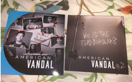
#8 DON’T STEAL ARTWORK OF ANY KIND
You don’t want to be sued for thousands of dollars like these guys. Even if you’re trying to do a parody, you have to contact the owner of the artwork.
#9 MAKE AT LEAST THREE OPTIONS
You can’t just make one design because you can’t be so sure which one works best.
Make at least three samples because even the best designers can’t get it right the first time. It’s added work, for sure, but that’s how it’s done.
#10 TEST
No matter how brilliant you think your packaging is, the consumers still have the last say. Print samples and gather at least 20 people and get their opinion.
If that’s tedious for you, simply upload your designs and let people vote. That’s the best way to know which works.
______________________________________________________________________
James Hill is a veteran of the music industry. He first worked at Warner Reprise Records then later joined Interscope/ Geffen Records where he managed producers and songwriters and got his first platinum record for Keyshia Cole’s The Way It Is. He is now helping indie artists with branding and manufacturing through his company Unified Manufacturing, a CD/DVD/vinyl and merch company in LA.